2023-07-07 00:00:00
4 min read
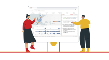
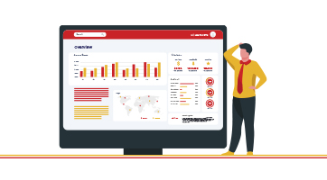
In today's data-driven world, we encounter various types of data, ranging from textual information to financial figures and spatial data. Each type of data requires specific databases and management systems to handle its unique characteristics. However, when it comes to data consumption, the approach takes an inverse direction. While transactional reports focus on a limited scope of data, analytical reports and dashboards present a diverse array of information, including key influences, KPIs, spatial data on maps, scorecards, trend lines, charts, graphs, and grids.
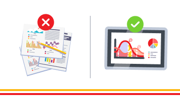
With such a wealth of data presented on dashboards, it becomes challenging for end-users to quickly grasp the key highlights by visually scanning the dashboard alone.
To alleviate this challenge, report and business analysts often manually analyze reports and craft textual narratives that summarize the essential insights. However, this approach introduces the potential for analyst bias, and the end-user may not always align with the provided narrative.
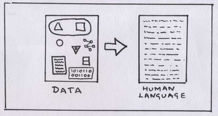
Some systems attempt to address this issue by employing complex machine learning, natural language processing, and other AI-based mechanisms to automatically generate smart textual narratives that capture the key highlights of the data. While this method is effective, it typically requires substantial resources and specialized skills, which are beyond the reach of a typical end-user seeking a self-service reporting tool to build their own dashboard.
In this blog, we will explore a solution that bridges the gap between complex AI-driven data narratives and the needs of everyday Power BI users. We will introduce an innovative custom visual called the "Phrazor Plugin" that empowers users to generate smart narratives tailored to their specific data insights, without the need for extensive resources or advanced technical expertise.
Before delving into the Phrazor Plugin, let's talk about the visual which analysts are used to, Power BI’s “Smart Narratives”
Power BI has revolutionized data visualization and analysis, empowering users to gain valuable insights from their data. Among the many powerful features in Power BI, the "Smart Narratives" visual stands out as a tool that automatically generates written summaries and explanations of data points.
How to generate Smart Insights, using Power BI ‘Smart Narratives’?
- Connect your data: Import or connect your data source to Power BI, ensuring it is structured properly.
- Add the Smart Narratives visual: In the Visualizations pane, locate and select the Smart Narratives visual.
- Configure the visual: Drag and drop relevant fields onto the visual, such as measures, dimensions, or hierarchies.
- Observe the automatic insights: Once the visual is configured, Smart Narratives will automatically generate insights and explanations based on your data.
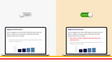
While Smart Narratives provide an effective means of conveying data insights, it's crucial to understand the boundaries within which they operate.
- Lack of tailored insights: Smart Narratives provide generalized insights that might not address specific requirements or contextual nuances of your data. The generated narratives are often more suitable for a broad audience rather than for specific users or teams with distinct needs.
- Inability to prioritize insights: Unfortunately, Power BI's Smart Narratives do not allow users to prioritize or pin specific insights to their dashboards. This limitation might hinder users' ability to highlight crucial information or focus on key metrics that require immediate attention.
- Limited customization options: Smart Narratives provide limited customization capabilities. Users cannot modify the generated narratives extensively or personalize them to match their organization's tone, branding, or style.
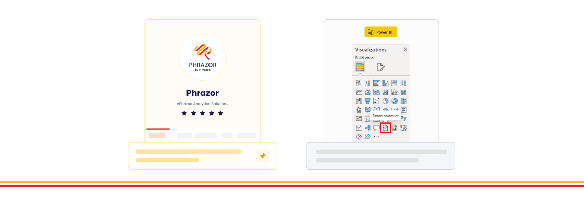
To address the limitations of Power BI's Smart Narratives and give users more control on the insights they generate, Our team at vPhrase, created ‘Phrazor Plugin’ a Power BI custom visual designed to enhance your data storytelling capabilities and generate narrative insights which can drill down into your data.
Setting up Phrazor Plugin is easy, simply:
- Select the report you want to run for generating visualizations and insights.
- Click Edit to activate the Visualization panel on the dashboard.
- Click on the three dots appearing at the end of the Visualization panel.
- Select ‘Get more visuals’ and search for ‘Phrazor’ to add it to your dashboard.
Phrazor Offers 6 different types of Analysis for you to generate insights on. These Analysis are created keeping in mind the different types of dashboards that users create and the type of insights they expect from their data.
- Descriptor: Analyze various measures on the basis of any dimension or time through Descriptor.
Example:
Let’s consider we are looking at the Sales data of Phones for the year 2021 of a store.
A sample Descriptor insight would be something like:
Out of the 4 Brands, Samsung and iPhone were the top Brands having Sales of [385K,374K] in the last 3 months.
- Change: Change generates a narrative that analyzes the variance of two measures across a time period.
Example:
Let’s consider we are looking at the Sales data of Phones for the year 2021 of a store.
A sample Change insight would be something like:
In the last 3 months, only Samsung experienced growth at 5.61 (▲ 7033.85) in terms of Sales. Within Samsung there was a growth in sales for Samsung S20+ (▲ 4.12K) and Samsung S20 (▲ 1.63K).
- Budget: Budget generates a narrative that analyzes the difference between the actual spend and the budget of a measure, across dimensions.
Example:
Let’s consider we are looking at the Sales data of Phones for the year 2021 of a store.
A sample Budget insight would be something like:
In the last 3 months, all the Samsung Models had an expense incurred of 23%
- Target: Target generates a narrative that analyzes the difference between the actual value and the target value of a measure, across dimensions.
Example:
Let’s consider we are looking at the Sales data of Phones for the year 2021 of a store.
A sample Target insight would be something like:
Since january 2017, only iPhone underachieved in terms of of sales against their target
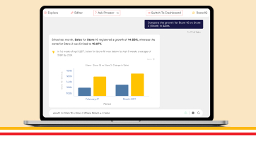
- Compare: Compare generates a narrative that examines the comparison between two measures, two dimensions, or a combination of both measures and dimensions.
Example:
Let’s consider we are looking at the Sales data of Phones for the year 2021 of a store.
A sample Compare insight would be something like:
Since January-2017, contribution of iPhone in terms of sales declined by 1.93% whereas same for Samsung grew by 1.87%
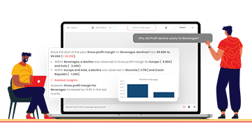
- Trend: Trend generates a narrative that examines variations in a particular measure over a period of time or for a specific entity within a dimension.
Example:
Let’s consider we are looking at the Sales data of Phones for the year 2021 of a store.
A sample Trend insight would be something like:
Since January-2017, overall trend of iPhone shows an decrease in Sales whereas in March-2017 it grew by 3.34%
Phrazor Plugin for Power BI offers variety of language Customization options for the Insights generated for the Power BI.
Users can customize their insights which they generate into reports by splitting them between sections and headers as per its relevance.

By setting hierarchy and co-relations, users can drill down into your narrative insights from a top to bottom approach.


By Harnessing this power of Phrazor Plugin, you can elevate your data storytelling and effectively communicate the most relevant insights to your stakeholders.
Try our 14 day free trial for Phrazor from today!
About Phrazor
Phrazor empowers business users to effortlessly access their data and derive insights in language via no-code querying